Three Tips For Better Pictures for Your Etsy Listings
Ok. How many times have you heard someone say that you need good pictures for Etsy? A bunch right? But do you actually know what means? I don’t know about you but I’m a visual person. So I put together some real life examples of Do’s and Don’ts when it comes to taking pics for your shop.
Lighting
I review a lot of Etsy shops and probably the #1 issue I see is poor lighting. When a customer searches on Etsy they see a lot of pictures on the search result page. You only have a second or two to capture their attention. Dark pictures are easily overlooked especially when positioned next to bright ones. Both of these pictures were taken inside with no extra lighting except normal overhead room lights. They’re just too dark. If you’re looking for indoor lighting this is a pretty inexpensive set that I have purchased myself – Photography Soft Box Lighting Kit on Amazon.


But, don’t start using your camera’s flash! That’s even worse! See how the colors get distorted and now there are shadows in this pic below? The best option is to go outside. Natural light solves almost all your lighting problems!

Cropping
Another problem is most pictures are not cropped well. Don’t leave TOO much space around your item like this:


But also don’t zoom in TOO close. You want just a little white space around your item.

Background
Your background matters. It should be light or white and simple. No clutter! Unless you purposely have your item staged with props there should be nothing else in your frame except your item and a clean background. You want your item to stand out in the photo so make sure there is nothing competing with it.
Like this glass door where you can see my reflection and the reflection of the tress and my car behind me:
Or this messy work table in my craft room:

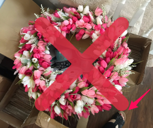
And definitely no body parts in the frame unless it makes sense for the product you sell!

 see my foot? lol
The best way to improve your pictures is to take them outside in natural light. Even a cloudy day is ok, often it’s even better than harsh sunlight. You can always adjust the brightness with the tools in your smartphone camera app – you don’t even need extra apps! I do it all with the camera app on my iPhone.

If you want to see how I do it check out this quick video: Easy Photo Editing Screenshare
If you’re a wreath maker like I am and you don’t have a suitable exterior door you can always buy a “fake” door. I found a few at a flea market last summer. An exterior door is better than an interior door because it allows customers to properly judge the size of the wreath on their own door. Interior doors are smaller and can make your wreaths appear larger and as if they don’t “fit”.


If you don’t have the space for an extra door you could purchase a simple photography backdrop like this one I found on Amazon that I laid on my driveway outside.

Or find a plain wall or flooring with good lighting

Taking product pics doesn’t have to be hard – I promise! Just follow these simple tips – take pics outside, crop your photo, and use a clean background – and your views on your listings are bound to increase. Happy creating!
P.S. If you want more tips for your Etsy shop check out my eBook for Etsy sellers!
*This blog post contains affiliate links. If you decide to purchase from any of these links I may earn a few cents from the sale. Just know you’re helping me to create more content just like this for you!


